8 Website Design Trends for 2016
- December 3, 2015
- User Experience, Web Design
It’s a great time to make an investment in your website.
Shoppers are estimated to spend $327 billion online in 2016 — a 62 percent increase in less than five years! This coming year, e-retail will make up 9 percent of total sales. According to Forrester Research, this large increase in spending is related to “online retailers improving their web sites and services.” Focus on zoom, color swatching, broad payment options and subscription plans make it easier for customers to buy on the web.
Of course, eCommerce is just one reason to maintain a good website. For most businesses, a website is a central part of a comprehensive online marketing strategy. All social media, content, PPC, SEO and email marketing work direct traffic back to more information presented on the business website. As Greg Shugar explains it in Entrepreneur: “Building a beautifully designed, fully capable website is no longer a luxury…. It’s a necessity.” Take heart: It’s far more affordable to compete with bigger, well-heeled competitors in this space than it is the brick-and-mortar world.
So what does it take to create a modern website that appeals to visitors?
First, let’s cover what it’s NOT. Business2Community lists the following dated trends: non-mobile-friendly sites, over-designing, beveled or embossed fonts, Flash intros, auto-play music and using stock photos. If you have any of these elements, then you know where to begin! On top of that, we like the following 8 ways to harness modern web design trends in your new website for 2016:
Here are 8 Ways To Make Your Website Design Better In 2016
[clickToTweet tweet=”8 #WebsiteDesign Trends for 2016″ quote=”8 Website Design Trends for 2016″ theme=”style3″]
1. Background Video
Background video became a big trend among forward-thinking companies in 2012, but it’s taken the rest of the world a few years to catch up. We expect background video to be embraced by many more firms in the coming year, especially considering all the talk about web users’ preference for video marketing. The use of background video captures the viewer’s attention and tells a unique story in a cinematic fashion. As Strikingly explains, your video can be artistic or action-oriented; it can tell a story with a collage or reflect a more subtle ambient energy that makes your website come alive.
This year, we redesigned the Stride website using background video. Check it out!

Image Credit: Coastal Creative
2. Hidden Main Menus
Designers used to think that a good user experience meant a blatant main menu bar stretching horizontally across the top of the screen. Yet, we have found that it’s possible to save valuable top-of-the-fold screen space and create a great-looking website on any screen size with hidden main menu design. The menu appears only when the user clicks on the appropriate icon, which is another intuitive way to navigate. Check out these examples of hidden menus.
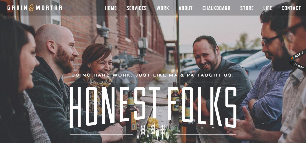
3. High-Quality Custom Photography
Stock photos are hated in the nation and you don’t have a photographer on your payroll… so what do you do? We recommend outsourcing work to a professional freelance photographer who can give you the personal touch you’re looking for and provide you with truly unique photos. We set up Stride with this connection as part of our consulting work. Contact us for details!
You May Also Like: 8 Modern Web Design Trends For 2015
4. Quirky Illustrations
Another continuing trend is the adoption of hand-drawn illustrations that give a “quirky, yet friendly edge” to brand, as Quertime puts it. Initially, illustrations just popped up on web designer, marketer, film, musician and artist sites. Now you’ll see drawings on websites selling apparel, cosmetics, zoo passes, food and more. Check out these great examples of hand-drawn elements on websites. In the past, we have used marketplaces like 99 Designs and Upwork to find quality freelancers at affordable rates.
5. Cinemagraphs
“Cinemagraph” is one of the hottest buzzwords in web design right now. If you’re on the fence between using high-quality photos and videos for your site, a cinemagraph gives you the best of both worlds. Moving images act as “living moments” that engage viewers better than traditional photos, but suck up less bandwidth than video. This stunning Paris cinemagraph created by Kevin Burg and Jamie Beck (the photographers who first coined the term “cinemagraph”) only takes up 3 MB, compared to the average video that weighs in at 8 GB! So if you’re looking to break up a long post, liven up your background or entertain new visitors for 10-15% longer, then a cinemagraph is your solution! You can create your own with Photoshop or hire a professional for this task.

6. Smoother Opt-Ins
Nobody likes pop-ups. And yet, for a business, the opt-in is an essential way to provide helpful information and build a contact list. These days, there are smoother ways to offer unsolicited-yet-useful assistance. Check out the Welcome Mat app from SumoMe, which greets new visitors to your site and is easily sent away with a quick click. If you’ve been to Neil Patel’s blog lately, you’ll notice he’s got one that pops up after you’ve clicked a few times to invite you to follow him on social media. A writer over at Business2Community has seen impressive subscriber rates (93/day) and conversion rates (4-8%) with the use of a new Welcome Mat.
7. Parallax Scrolling
We just love the depth of parallax scrolling! From piquing a visitor’s curiosity to inspire longer time spent on page to leading people to your call-to-action, there are a myriad of reasons you may opt for this type of aesthetic. This web design technique is reminiscent of the old Nintendo games, where the background image moves slower than the forefront images. Again, this trend has been around for a few years but we expect it to continue well into 2016 and it’s still something we love using to “wow” our clients who are used to more traditional “static” sites. For inspiration, refer to these award-winning designs featuring parallax.
8. Interactive Storytelling
We’ve talked a lot about design and a website’s appearance thus so far, but you know as well as we do that content is the foundation of any decent site. People love a good story, especially one that presents enough to whet their appetite for information, but leaves a little bit of curious flavor behind to savor. More and more designers are playing with space and interactive methods of storytelling that moves visitors along an animated journey.

Check out this super cute example of interactive storytelling!
Ready For Website Redesign in 2016?
Mandy McEwen and the Mod Girl Marketing design team has had a busy 2015. While we no longer take care of web design in-house, our consultants have helped a number of companies find the help and resources they need to pull their visions together. Over the past decade, we’ve amassed many reliable connections with web designers and freelancers we can connect you with if need be. Here are three new website designs we helped launch this year:

For www.stridenyc.com, we recommended implementing background video, parallax scrolling, big image headers and custom photography.

For www.roxyplasticsurgery.com, we thought background images, parallax scrolling and adding a few statistics to the ABOUT page would improve user experience, create a more personal vibe, and boost credibility.

For www.christiancoachinstitute.com, we beefed up the social proof and use of testimonials throughout the site and used bold orange colors where we wanted to direct more eyes. We added a bigger blog image, as well as a a new and improved header background throughout the site, too.
Are You Testing For Results?
“UX web design” is a term you’ll hear frequently these days as more and more designers begin to shift the User Experience to the forefront of their minds, rather than simply flexing their creative muscles. Along with giving you a new website, we conduct usability tests and conversion tests to ensure performance as well. We use HotJar Analytics to view visitor recordings and heat maps, for instance. Web design is a continuous process. Smart businesses are always tweaking and optimizing their websites for a better end result. Contact Mandy McEwen & the Mod Girl team to learn more.


Read my latest posts
See all posts")
")
")